Q: "How do you feel about the early designs you did as a freshman or sophomore in architecture school? How did they look like?"
It’s a question I’ve been getting often as of late, so I thought I’d semi-formally answer it on the blog.
I chuckle a little bit whenever I’m asked this, because it involves me looking at my own motivations and process at the time, and comparing them to what I know now.
And there is a really big disparity between the two.
Quite simply, I can say now that my approaches back then were flawed, unrestrained, form-centric more than they were occupant-centric, and paradoxically incohesive. They were messy and didn’t consider a lot of things properly.
But that’s fine. Because that’s how a lot of our early works really do end up.
It’s a rite of passage of sorts, especially for this generation of contemporary designers that are giddy to produce iconic forms. (This ain’t all bad. At least it means you aren’t settling for boring architecture.)
It’s normal, and in some ways, needed in order for you to discover how to develop as a budding architect.
Besides, if I were designing the same way today as I was when I was a freshman, then it either means I didn’t need architecture school (yeah, sure), or I didn’t grow at all.
Today I’m going to discuss a few of my earlier design projects, how I worked on them at the time, and what I amusingly saw when I looked back at them. The three are my first two houses, and an archaeological studies center for within the university.
Before we get to the actual projects though, here are a few overarching points on how my design process went way back when.
Related: 26 Things About Design Process That You Should Know

1. I was designing from the outside-in.
In your first year or so, you don’t yet know so many key design considerations- and your process tends to linger on a very formal, superficial, and trying-to-impress-your-peers-and-professors paradigm.
And so I would focus on exterior form – how to make it look more complex and modern- at least with respect to what I thought “modern” meant at the time.
My focus and primary consideration was what if it would look cool enough from the outside, and how the program was inventively infused in the interior space was a secondary thought at best.
In other words, my perception of what mattered in great architecture was focused on the “outer shell”, and its impressiveness to the observer.
You might also like: Q&A #2 – 9 Meaningful Points on Becoming Happier, Today.
2. I was designing primarily through Sketchup.
I decided to self-study Google (now Trimble) Sketchup a few weeks into my first semester, and by the time our first house plate came by, I was raring to showcase my newly learned skill.
Sure, I was still a self-taught beginner. I didn’t know anything about groups, components, scenes, the copy tool, and a whole lot of other productivity tools – which was basically suicide in its inefficiency – but i’ll leave that story for another blog post.
Despite this, learning to Sketchup early-on was great because it made deriving perspectives and elevations a whole lot easier for my submissions. I remember me being all giddy when it was pointed out that I was the only freshman who submitted additional computerized work.
With regards to giving more than what was required, my early relationship with Sketchup was a very valuable one-up.
However, my 3D modeling frenzy was also a bane as much as it was a boon – especially with regards to the integrity of my actual work.
My reliance on Sketchup also limited the design itself. Because instead of first conceiving the final parti or concept, I’d play along with the software as it went, and my final design was asymptotic to what my shoddy Sketchup skills could produce.
Sure, the perspectives and superficial attention to detail impressed my peers, and my professors appreciated the bonus effort – but me as designer would later realize that the method really was self-limiting.
3. I didn’t know anything about structure, utilities, and other technical aspects.
Which you really won’t as a freshman.
None of my early designs gave any thought to column placement, beam depths, or any consideration to what kind of framing my roofs would have.
I had no concept of what doing a cantilever would entail with regards to forces on my building, nor could I pinpoint where shear and bending were greatest and conceptually adjust my members.
I didn’t know what a soft-storey was, whether a column was more prone to buckle or be crushed, or whether to use beams or trusses for a certain span.
I couldn’t pinpoint along which axis my composition was weak against lateral loads (and compensate with members like shear walls), or try to minimize re-entrant corners with separation joints.
The most I dipped my toes into engineering considerations was to stack the bathrooms on top of each other to save on piping. That’s it.
Lighting? I just made sure to put lots of windows everywhere. Nothing quantified.
Ventilation? Lots of windows everywhere. More on the north, and less on the east-west. Nothing quantified.
Electricals? I just had a “utility” area.
Mechanical Systems? I didn’t give much thought to what kind of air-conditioning system to use, and how it would fit into the overall design composition.

4. I extruded floor plans, and then put cosmetic articulations.
For the most part, my early works started by putting together and chipping off boxes to make a first floor plan, extruding it upwards to make a second floor, then changing some walls and jutting out some parts to make the facade more interesting.
From there, I would put a whole lot of “add on” articulations to make plain areas less boring. All these different finishes on different faces, and some embellishments here or there.
Were they functional? Some, were a bit, yes. But the others were just there to be showy and look pretty to the untrained eye.
My friends and batchmates complemented me for my “complex” and “detailed” designs, but I’m pretty sure that my professor at the time saw through the fluff, chuckled a bit inside, and gave me a good grade for all my efforts.
5. All in all, I was designing a building of fragmented, chamfered boxes that were patted on with fluff, and not a cohesive set of spaces.
Speaking of my professor at the time, she also ended up becoming my thesis adviser. How about that.
It was really cool because as I’d consult for my final design project in my undergraduate life, we were able to reminisce and think about my journey in architorture. (It was very fitting, because the concept of my thesis was Book-ending.)
“Oh Aldo, remember when you were just a little freshie with your cute little boxy house? The one that looked nice on the outside but was very compartmentalized? You’ve really grown a long way from that – you’re now a careful designer of space. Congratulations.”
True enough, for my first works, the exterior form did not seamlessly relate to what was going on in the inside. I gave less thought to the continuing experience and spatial sequence of the occupants – and more on something that would look pretty cool from the street.
Oh wait.
Before I get ahead of myself, what’s say we now take a look at my three early projects?
You might also like: 36 Things You MUST Consider When Designing Your Project
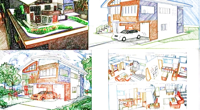
ARCH 20 – The Musical House.

This was the first house I ever designed, in my 2nd semester of freshman year.
The client demographic was a small family that liked playing music, and from what I recall, my resultant concept was for the house to be “a semiotic analog of music as expressed through architectural elements, and a symbolic beacon of hope”.
Big words. But as is expected, my translation was limited in scope. After doing all the bubble diagram exercises and boxing out my floor plan based on service and living requirements, then I started to infuse “musical analogs” into my architectural elements.
So I designed my stairs to remind you of piano keys.
I used different materials like concrete, steel, wood and brick to express the different “vibrancies” of musical instruments.
I altered finishes within the same wall planes to express the “variance” within a sound wavelength. But really, it was just so the boxiness wouldn’t be so obvious.
My roof was problematic because my walls were jutting in and out. So I solved it by using two curved sheets and intersecting the walls upward – again, not knowing how the heck it would be framed.
And then I realized, “hey, doing the two sheets this way sort of reminds you like a dove’s wings… a symbol of hope!”. And so I did.
Then I put these different articulations to spazz up the facade. The egg-crate one on the left side of the house is supposed to be a “semiotic anthropomorphic manifestation” of a human “ear”.
That brick molding thing on the cantilevered bedroom over the garage? It has absolutely no purpose but to “express rhythm”. Under it is a “plant box” with a depth of 200 mm. Brilliant.
Notice how the windows don’t relate to each other and are misaligned. And notice how I have so many different kinds of windows for the sake of making the facade look more complex.
You might also like: 22 Simple Guidelines for the Successful Architecture Student

Yup. That’s how I did it.
Now whether or not the design actually is nice-looking on a superficial level or impressive for a freshman effort, well, that’s up to taste.
But with regards to the integrity of the design process, I can unashamedly say that there was a lot of depth to be desired.
Related: The 5 People You Meet in Every Project: Who Are You REALLY Designing For?
If you were to take me back and have me redesign this house, I wouldn’t have made my concept try to “look” musical; I would have crafted the spaces towards the experience and production of music. I’d do something more experiential and less formal.
Maybe an indoor jamming court, a more intimate performance area in the living room, and a careful treatment for acoustics all throughout the volumes.
I’d devote more rhythm and artistry in the interior treatment, trying to use my structural grid to complement the said rhythm, and make sure the exterior was a reflection of what was going on inside.
I’d ensure that all my articulations on the outside could be justified by at least two reasons (cross ventilation and light permeation concepts maybe), and I would relate the garden to the interior. There is so much music in the serenity of nature, after all.

*Pat pat* You taught me well, little freshie house. I thank you for all the learnings. I have taken them all to heart.
Moving on, we can see the second house I ever designed.
ARCH 21 – The IE Residence.

When I got to my second house- which was the first design plate we had in our sophomore year – I developed a sort of artistic agenda.
The client was again for a small family, with the two parents being Industrial Engineers. Looking back, I could have made the house a study in aesthetic efficiencies and spatial order, but I had no such inclinations in my thinking.
In my head, whoever the client was, I already had a bias in mind for the design.
You see, I convinced myself over the preceding semestral break that I had to develop my own “signature style”, so that my work could be recognized instantly during pin ups or exhibits.
“Signature style”, meaning a group of aesthetic elements that I would stick into my designs to make them “Aldo-fied”. A thumb print, if you will. A sort of ego-generated one at that.
I thought of Gehry, Libeskind, or Zaha, and sought to make this second house a way to cement my “style”. (I now know that trying to force fit a “formal” approach is one of the most shallow things a student can do).
Related: The 5 People You Meet in Every Project: Who Are You REALLY Designing For?
So I integrated elements from my previous house, like the kind of windows, the exterior stairs, the “modern and clean” white walls, the glass stairway, and the curved roof.
The curved roof. Oh the curved roof. My savior for my irregular, jutting out walls. Again, no idea as to how the roof was framed. It was just… there. On top of the walls, helping my work look like my last one.
And again, I didn’t give thought to how the shell would relate to the interior, which would in turn relate to the garden. Wait, I didn’t even give thought to the garden.
How did I justify my approach? I reasoned out that the “heavy use of complex metallic elements made the house express the complexity of Industrial Engineering”.
And I put solar panels (oriented wrongly) to show that I was thinking very technologically, like an Industrial Engineer does.
I know. I know.
And I didn’t stop there.
You might also like: The BIG 4: Aspects of Architectural Education You Just HAVE to Focus On.
ARCH 21 – The UP Archaeological Studies Center.

The last work I’d like to share is the project that followed the IE Residence – in which I would try and force fit my “style” again.
The design brief was to design the new home of the UP Archaeological Studies Program (ASP). The program was to include offices, classrooms, a library, and a museum.
The concept for this was to resemble a “ship”, that had an axis pointing to the old location of the the UP ASP. So for this third design, I started putting come careful thought in building orientation to add some depth to the architecture.
Beyond that though, it was still the same old “style”, with the same disregard for alignment and occupant experience.
Of course, notice the curved roof, again.
Notice the extruded box floor planning, that sought to be illusorily covered up by the glass staircases and material breaks.
That angled glass wall was the “pointing vector” towards the old ASP location, so it still sort of makes sense to me today.
As for that little brown articulation above it, as well as the other corners of the roof…. they have absolutely no purpose.
I think I put them there because I thought they looked cool and pretty darn ship-like.
The huge singular building is also placed inside the lot by 50 meters, so what is fronting the street is a parking lot. A concrete heat bomb that will make those glass walls burn the occupants even more.
Notice how there is absolutely no tree buffer to shade the building from the sun on any side. Any interior courts? Nope. It’s just one giant microwave, one that commuters will have to cross the sahara desert for just to get inside.
A giant microwave with my “signature style” at the time.
Related: Pointers for Designing an AWESOME Room – Part 1: 20 Tips
***
And there you have it: a number of the silly things I used to do as an young designer. Naturally I was convincing myself back then that my process did have integrity, but my older self knows better. A lot better.
Over time, I would slowly and surely grow from my youthful misconceptions, and my design process transformed rapidly in my upper years – formed by a number of mentors and influences.
I have no shame in sharing these oversights, because they’re just a testament to how much architecture school can continually form you as you progress in your stay.
So don’t sweat the mistakes of your early years. They don’t define you. You’re first work doesn’t determine your legacy and imprint in architecture school.
For the most part, it’s your last work that does that.
For my last work, I decided to even infuse some of my youthful design inclinations – but use them right this time.


…. And seeing how you’ve grown since your clueless freshie days is one of the best feelings ever. Everyone deserves to experience it. Good news is, all it takes is a steady commitment to proper process.
So don’t be afraid to make mistakes – anything you can learn from is a precious, precious gem.
Like life, design school is a marathon, not a sprint. Look back, and stop to smell the flowers.
Live hungry, and keep growing.
Cheers,

If you have any questions, suggestions, or comments, I’m easily reachable by our Facebook and Twitter, or by email at aldo@archistudenthelp.com.
Don’t hesitate to ask. 🙂
Want to learn more about myself and the blog?
Click the image below to return to see all posts related to BLOG INFO and Q&A!